Purefit
Project details
- Client
- Purefit
- Scope
- Brand
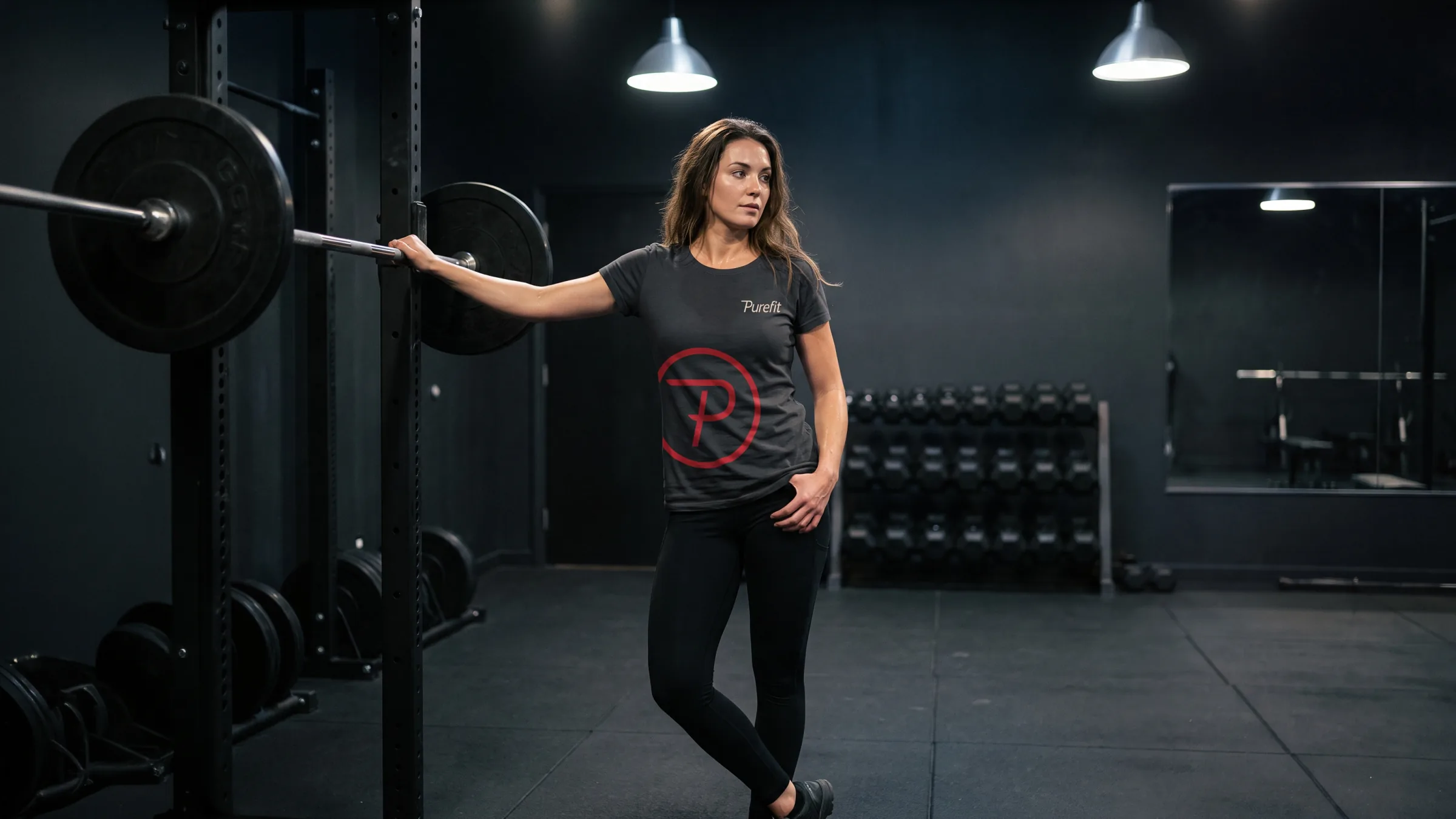
Purefit sells one trainer’s full attention and nothing else, so its identity added nothing either: an oblique wordmark, a circled P and one red on black.

Brief
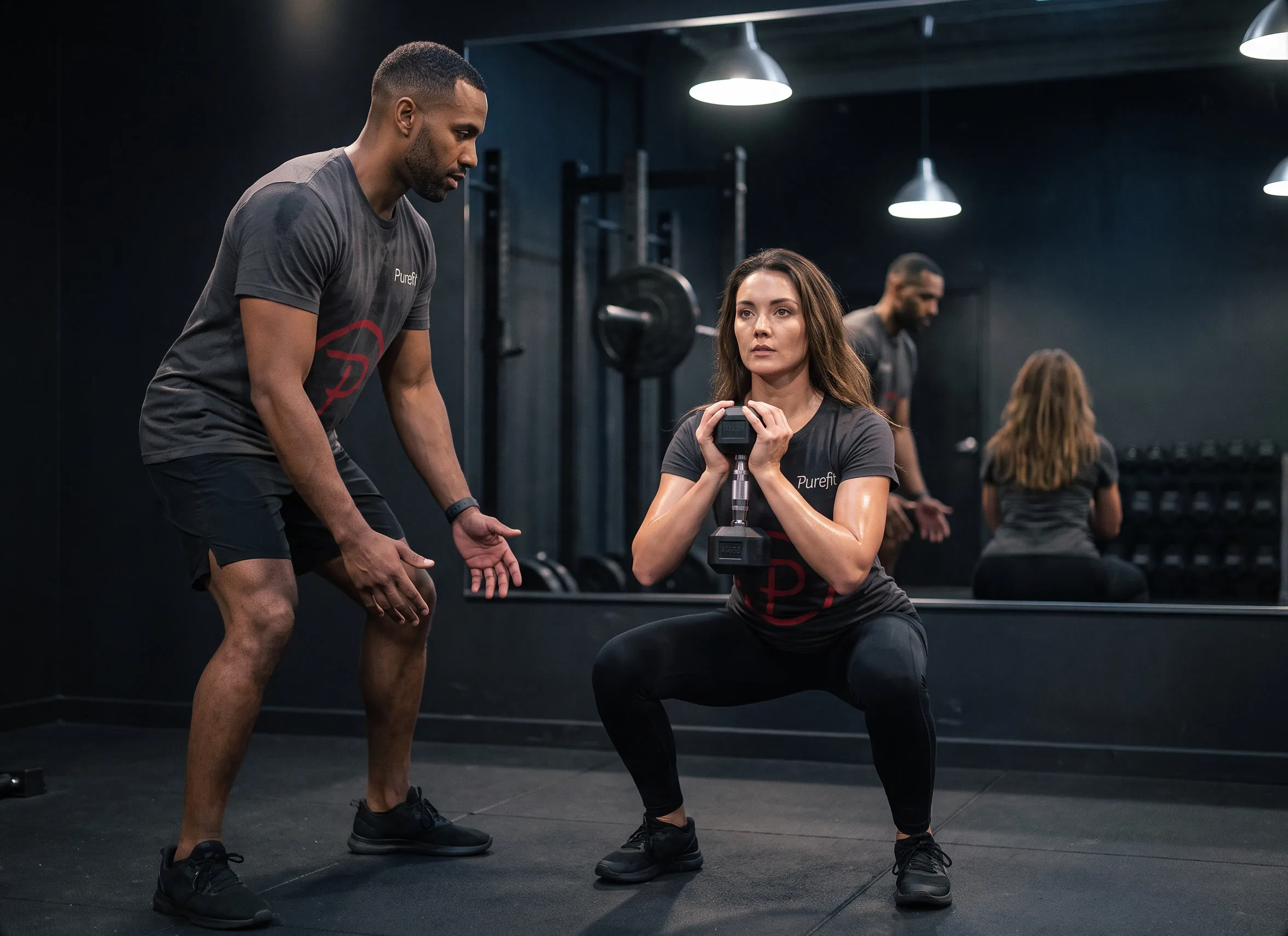
Purefit sells one thing: a trainer’s full attention. One trainer, one client, and nobody else in the room. No class, no app, no template.

Colour
- PrimaryBlack#000000
- AccentPure Red#EA222D
- SecondarySlate#6D6E72
- BasePure White#FFFFFF
Type
 PrimaryAller Oblique
 SecondaryAvenir Book
Approach
Wordmark
Aller Oblique in a light weight, leaning forward.
Monogram
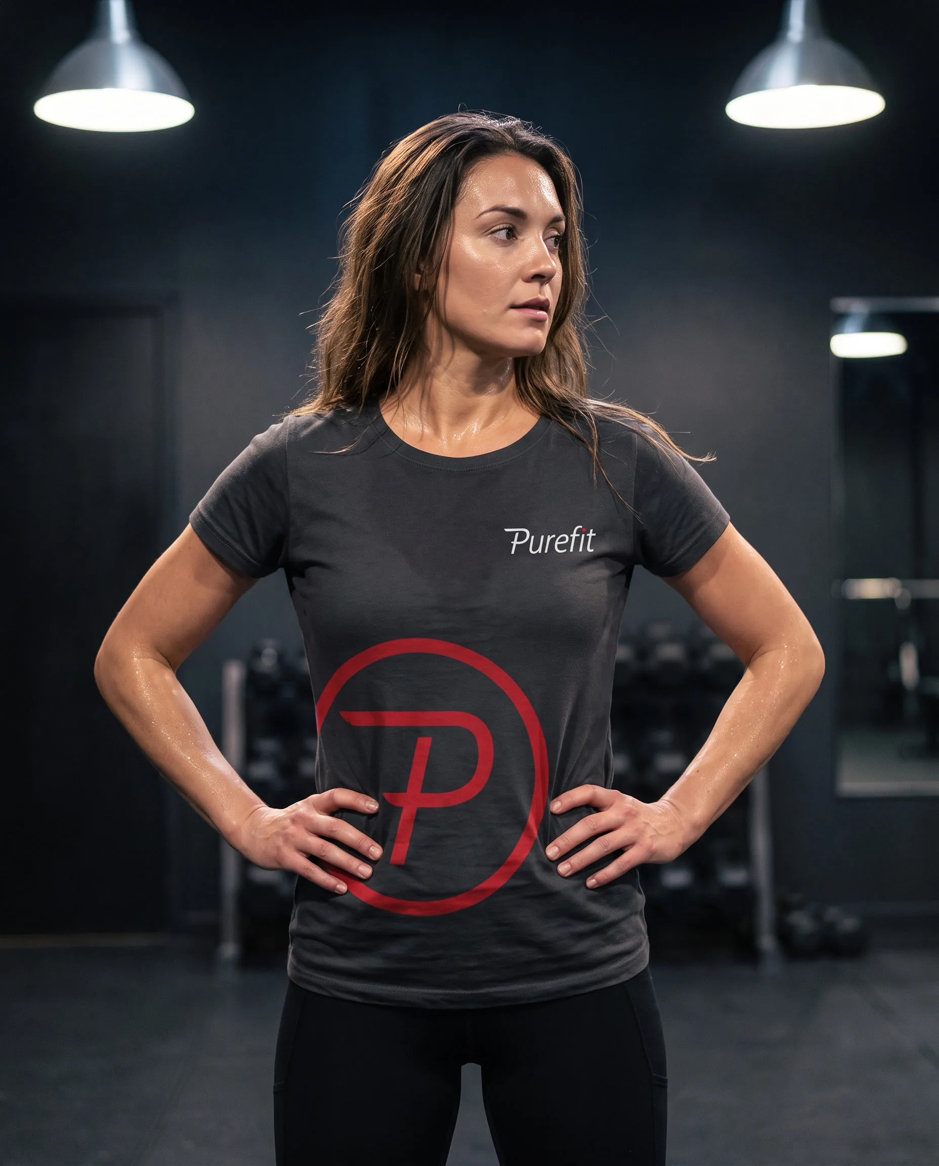
One letter inside one ring: the service in a single shape, one person and all of the attention.
One red
Black and slate hold the rest, so the red lands only on the ring and the dot on the i.
Result
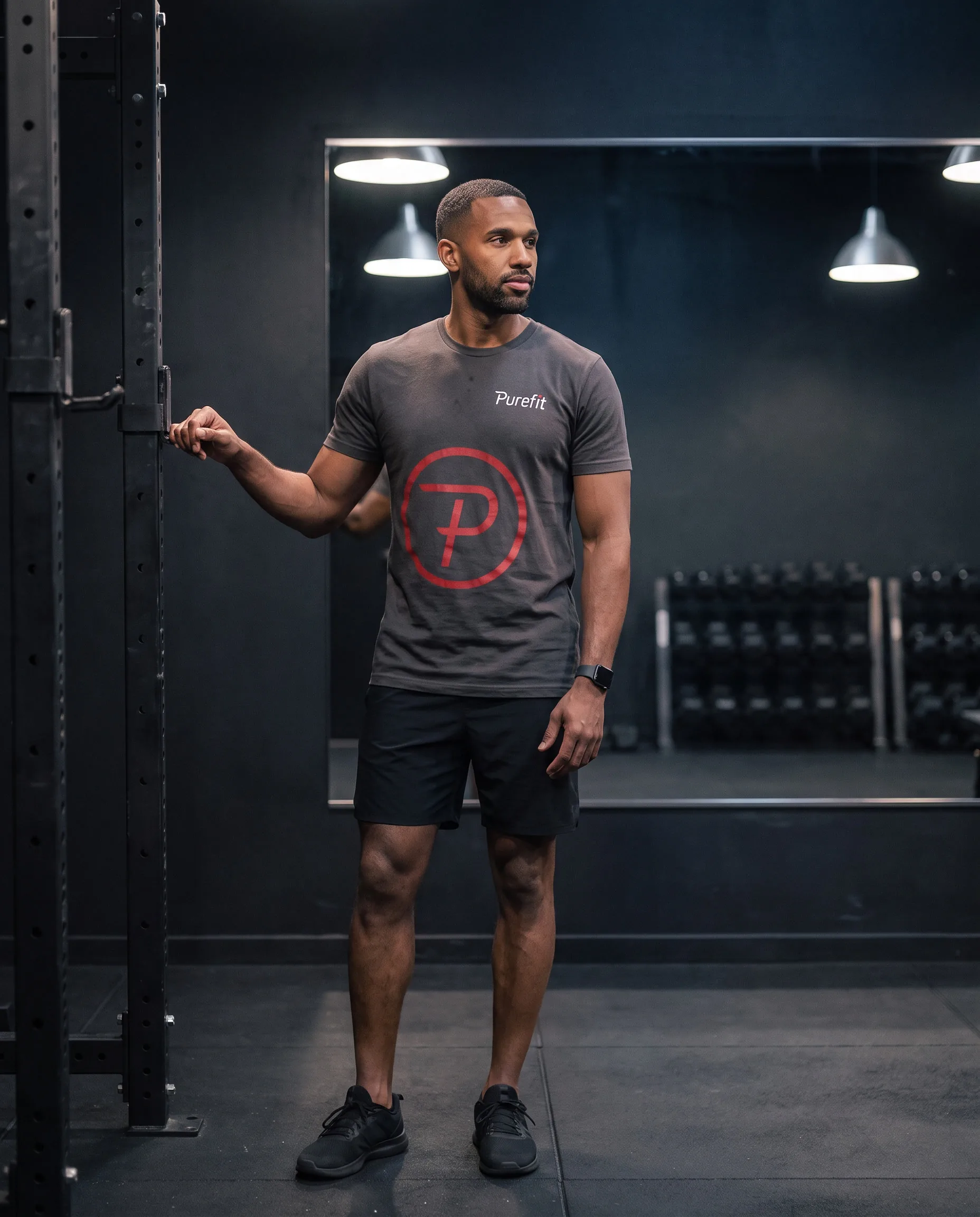
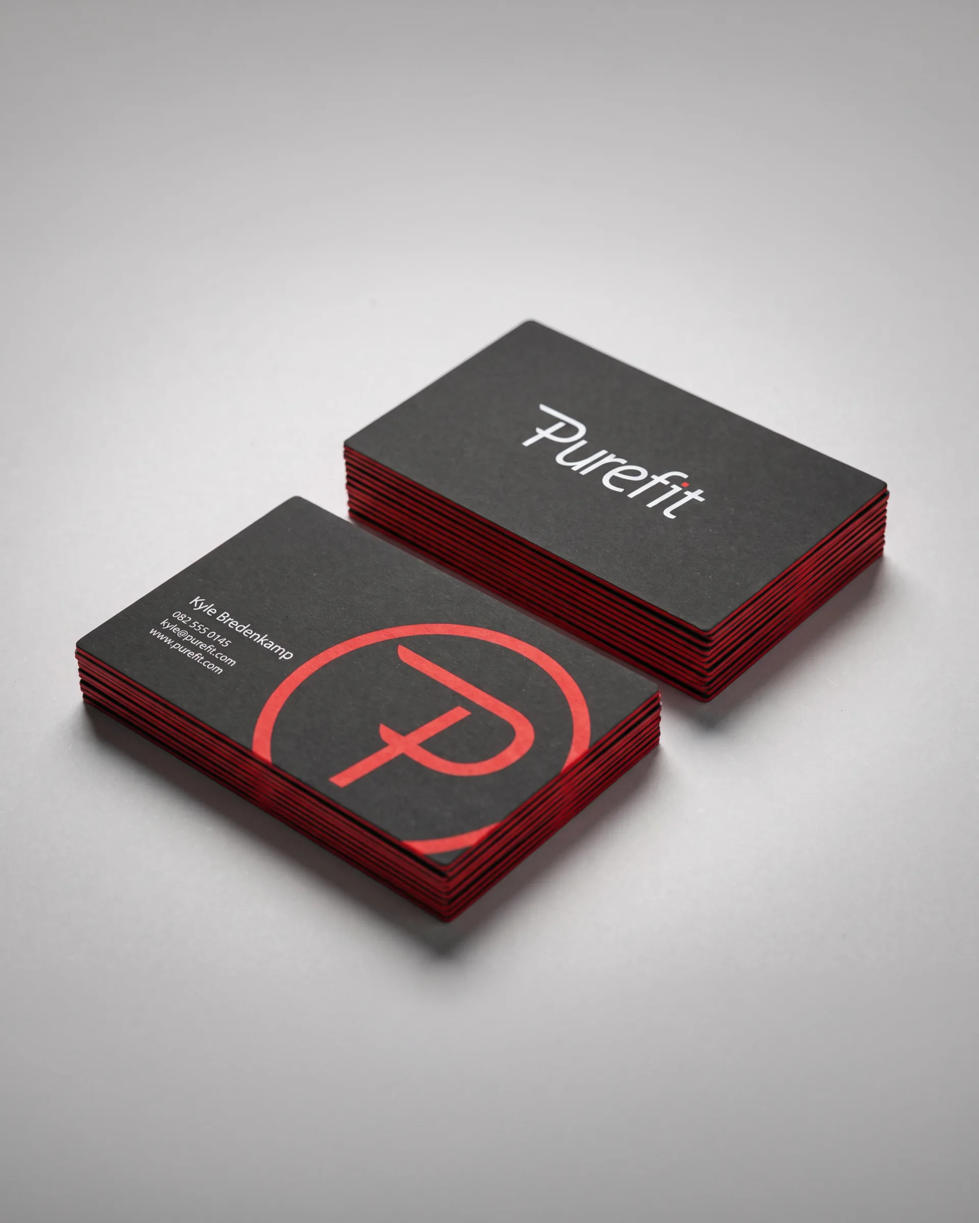
The business cards are black with red edges, so the accent shows even in a stack. On the kit, the monogram goes large and the wordmark small: nobody else in the room, and nothing else on the shirt.
Credits
- Logo and identity
- Will Derman