Seaya Holidays
Project details
- Client
- Seaya Holidays
- Scope
- Brand + Web & Code
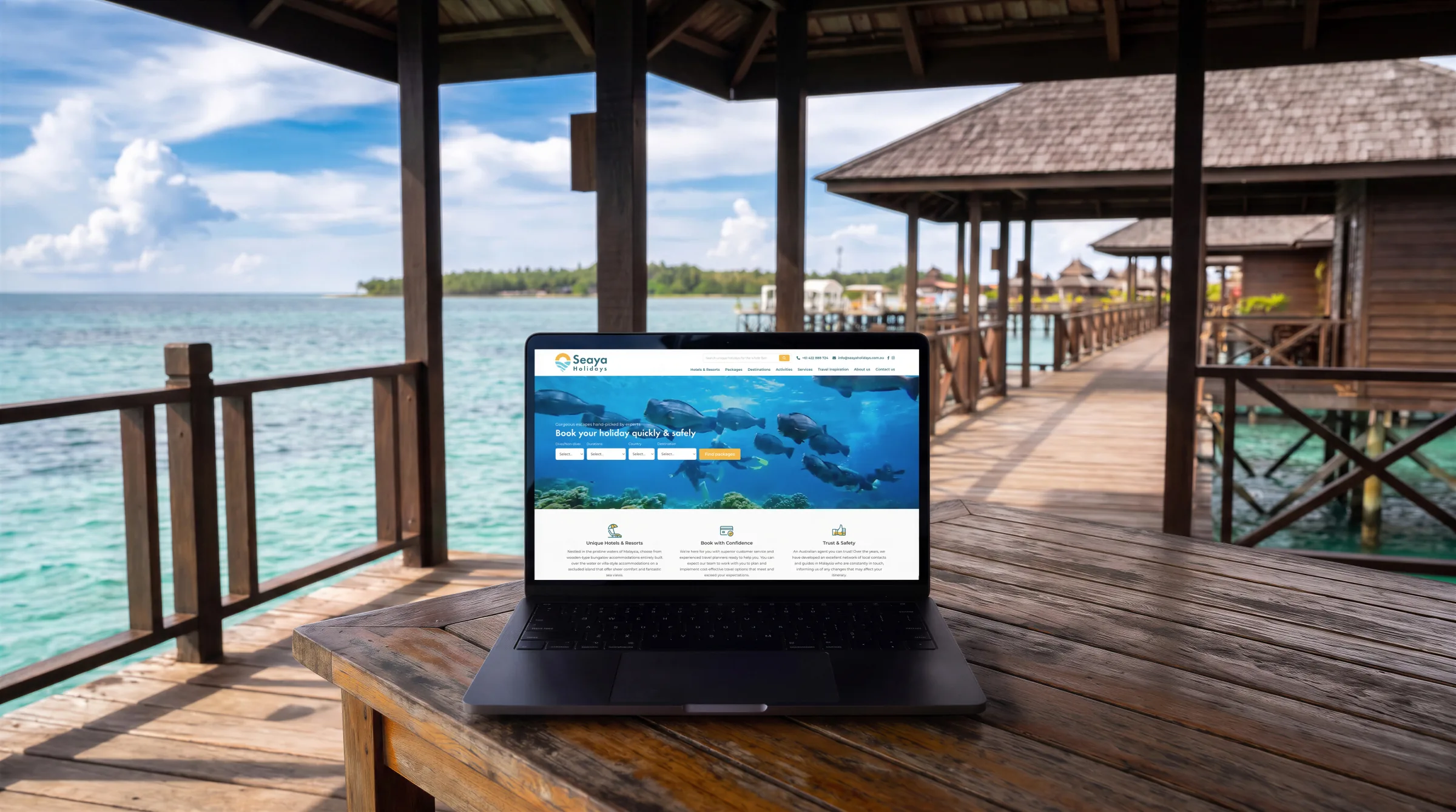
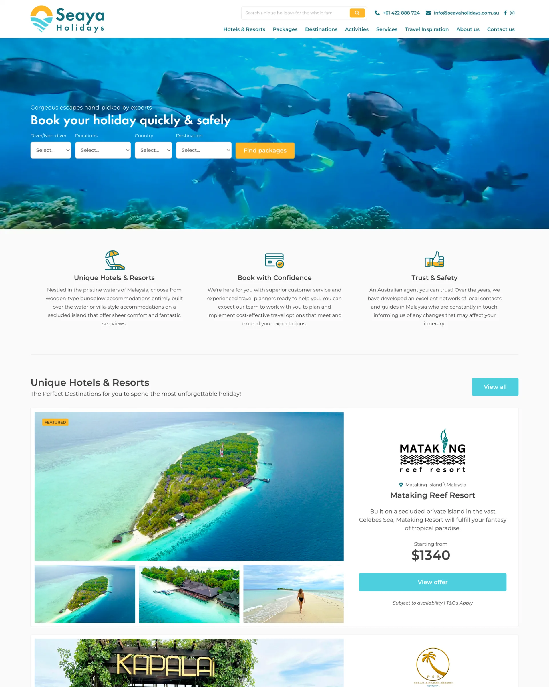
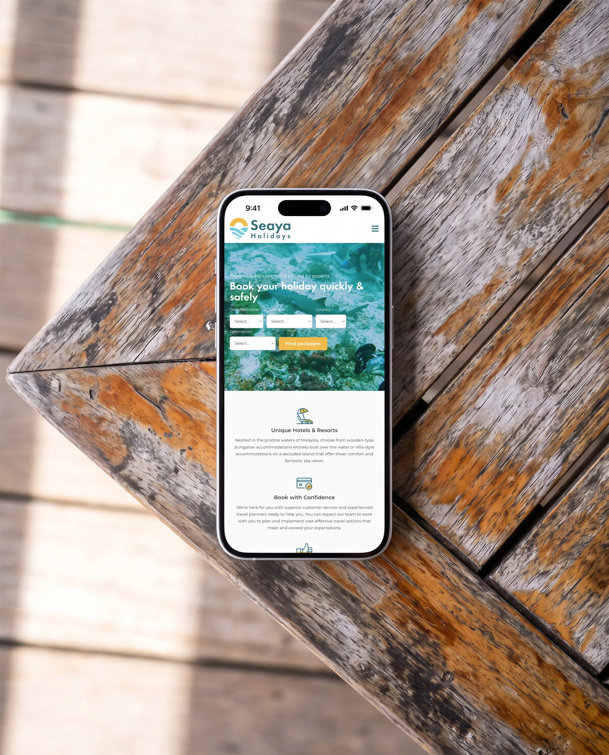
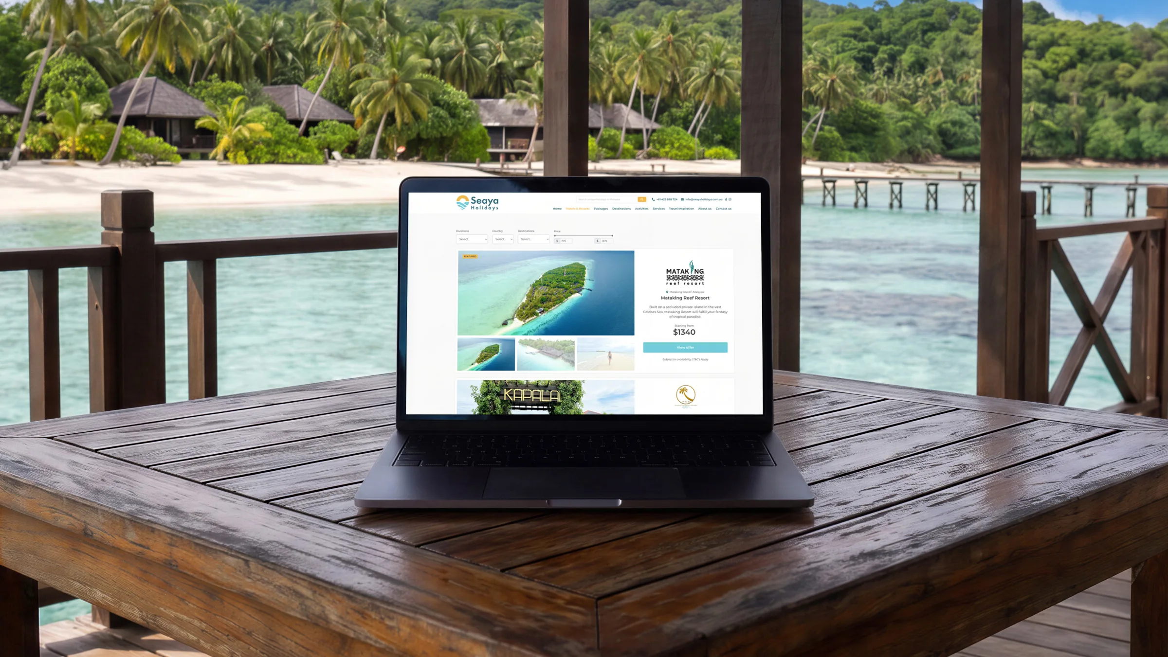
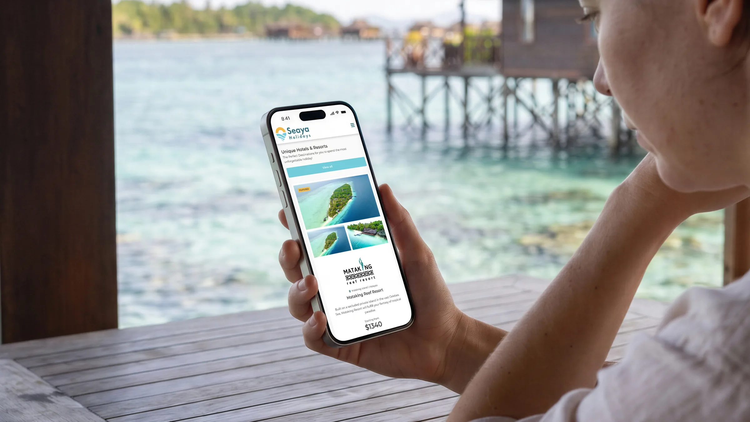
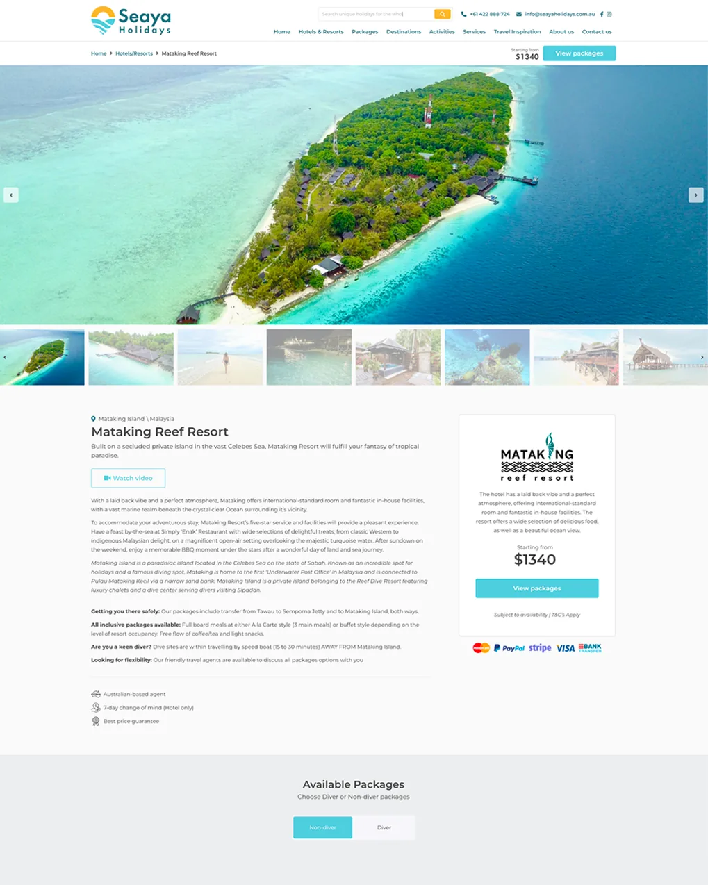
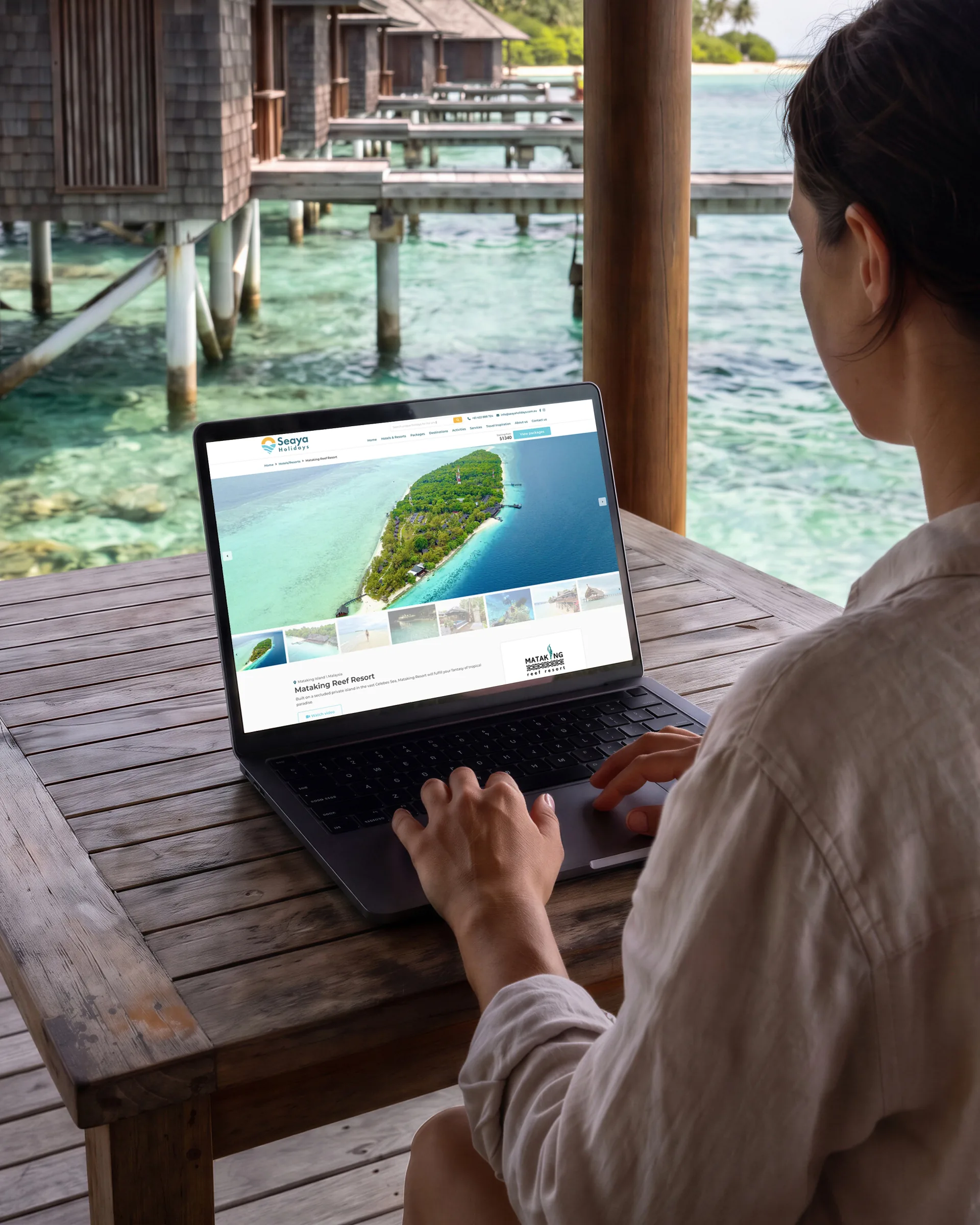
For people who pay before they fly, Seaya Holidays’ booking site put each resort’s rooms and packages on one page. The logo was designed alongside it.
Brief
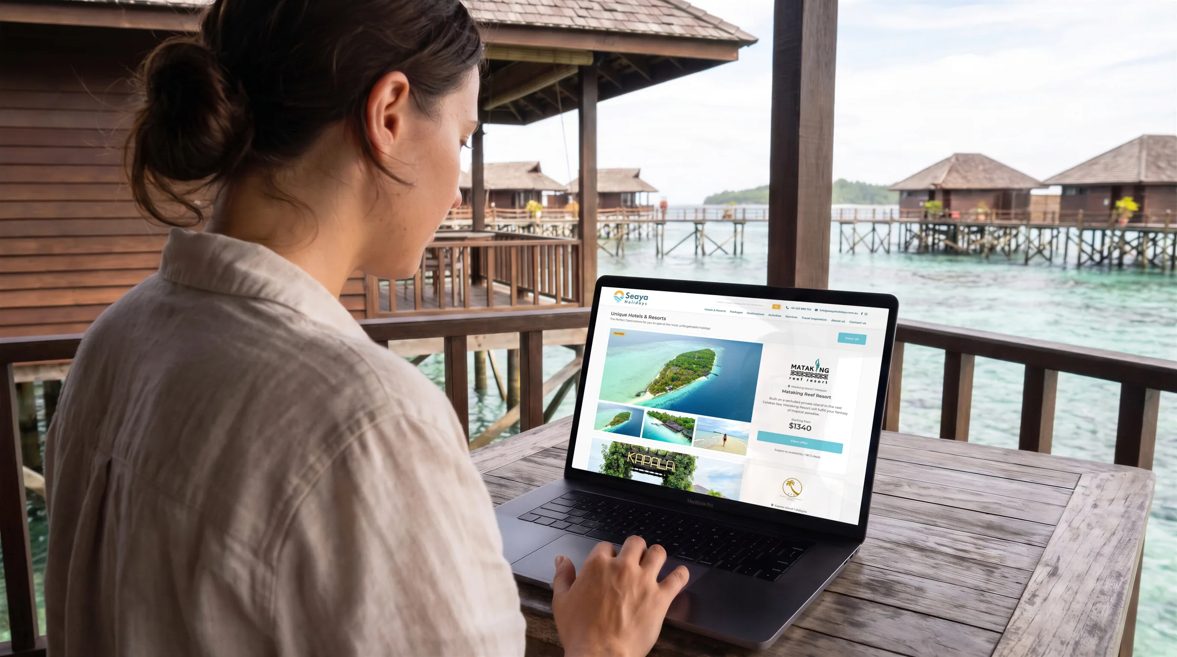
Seaya Holidays sells Australians dive trips to Malaysian islands they’ve never seen. It has no shopfront, so its site had to answer what people would ask an agent across a desk.

Colour
- SunGold#F0B448
- WaterMid#6CC0D8
- WordsTeal#306C78
- BodyGrey#5A5A5A
Type
 PrimaryFutura Demi
 SecondaryFutura Light
Approach
Logo
A place rather than a monogram, so an unknown agency could look like somewhere worth going.
Research
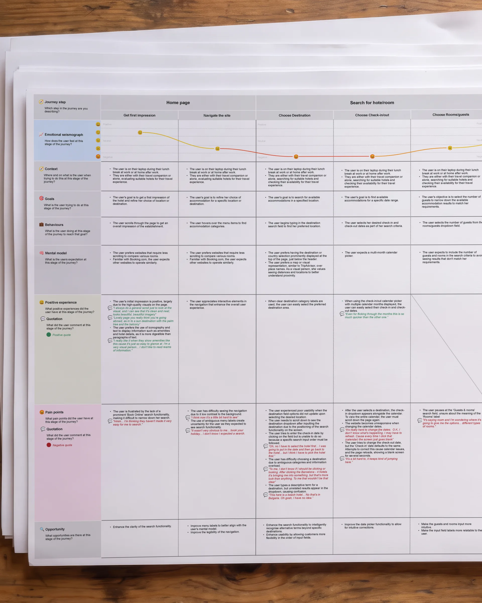
A survey of 35 people, and four hotel bookings watched up close.
What stopped people
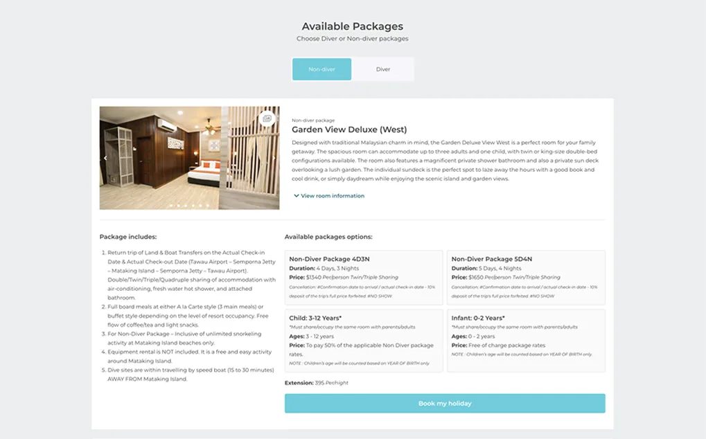
They weren’t confused. They were unconvinced, and wanted rooms and packages side by side.
Result
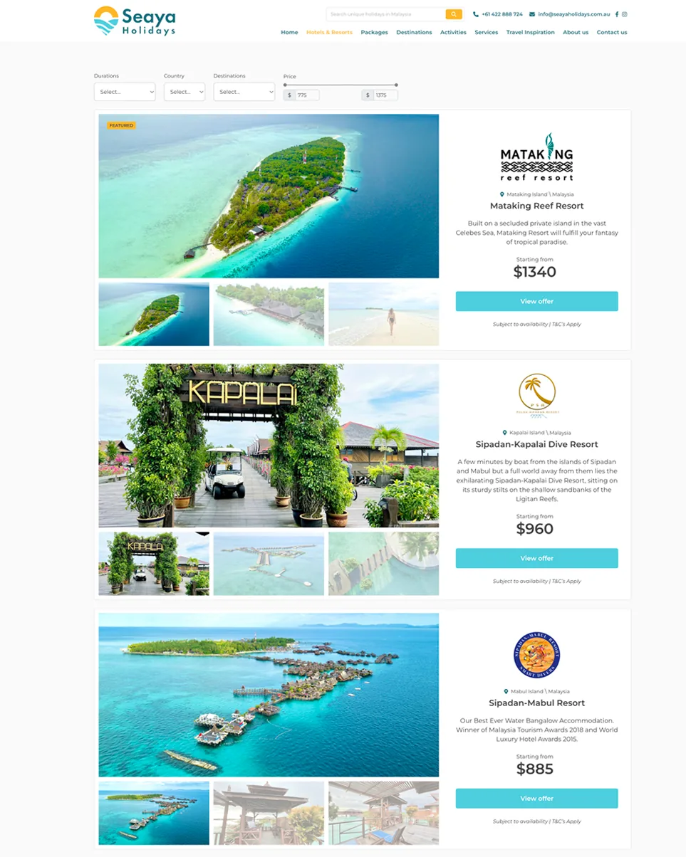
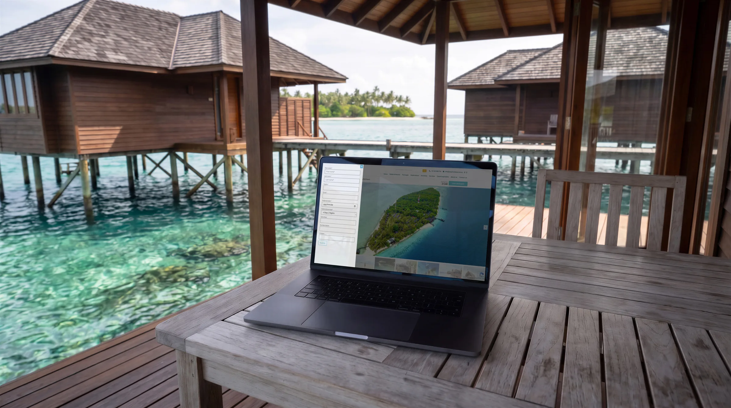
Each resort got one page to read across, with a booking button on every room, instead of a form split into steps. Nothing that decides a sale was left behind a click.
Credits
- Research and interaction design
- Will Derman
- Logo and visual design
- Will Derman
- Front-end build
- Will Derman